CRE marketing guide
Drive-time maps and isochrones for commercial real estate listings
How to make honest drive-time maps for a CRE listing: isochrones, destinations, traffic assumptions, and how to label the method and the date.
Why drive time beats distance
Buyers and tenants of industrial, retail and office space rarely think in kilometres. A logistics operator wants to know how long a truck takes to reach the highway; a retailer wants to know how many people live within a short drive; an office tenant wants to know how long staff will spend commuting. Drive time answers all three, and distance answers none of them well.
Two sites the same distance from a highway interchange can be very different: one has a direct arterial road to the on-ramp, the other has to cross a rail line or go through a residential area. A drive-time map shows that difference at a glance, which is why a connectivity page with drive times has become standard in brochures and offering memorandums for industrial and retail property.
What an isochrone is
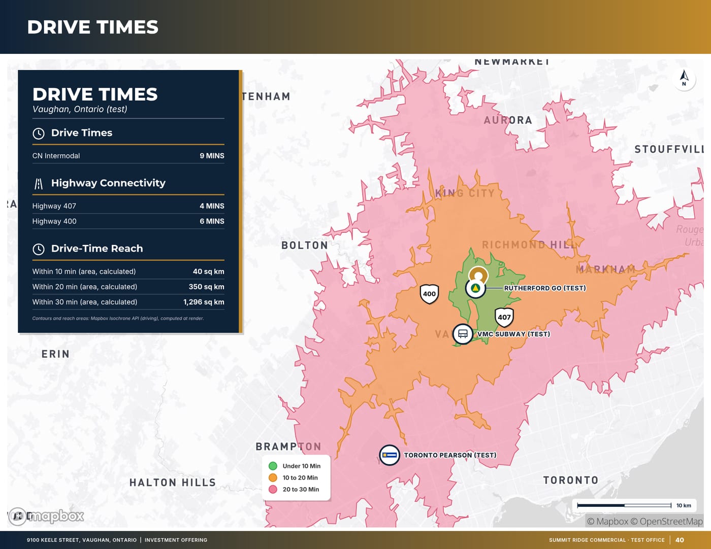
An isochrone is the area that can be reached from a point within a given travel time. On a map it is drawn as a shape around the property, usually for several times at once, such as 10, 20 and 30 minutes. The shapes are irregular because they follow the road network: they stretch along highways and shrink where roads are slow or missing.
Isochrones are calculated by a routing engine using road speeds, turn restrictions and, depending on the service, typical or live traffic. Different services and different settings give different shapes, so an isochrone is an estimate, not a measurement. That is fine as long as the page says how it was made.
Isochrones versus radius rings
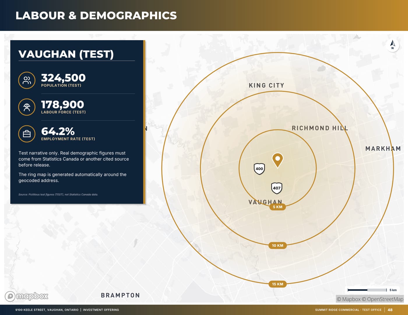
Radius rings (circles at 1, 3 and 5 km, for example) are simpler and still common in retail reports, because they make demographic comparisons between sites easy. But a circle ignores rivers, rail lines, highways without interchanges and the actual road grid. For anything about access or commuting, a drive-time area is the more honest picture. If you do use a radius, call it a radius and never describe it as a drive time.
Choosing the time bands
Pick time bands that match the decision the buyer is making:
- Industrial and logistics: 10, 20 and 30 minutes is a common set, with the 30-minute area often used for the labour catchment.
- Neighbourhood retail: shorter bands such as 5, 10 and 15 minutes, because convenience shoppers do not drive far.
- Office: commute-oriented bands, and transit travel times alongside driving if the property is near rapid transit.
- Land and development: the bands that matter to the likely end user, plus the time to the nearest interchange.
Three bands are usually enough. More than that and the map becomes a set of nested outlines that is hard to read.
Destinations buyers actually ask about
The shapes are only half of a connectivity page. The other half is a short table of travel times to the places that matter to this kind of property. For an industrial listing in Ontario, that might be the nearest 400-series highway interchanges, an intermodal rail terminal, the nearest international airport and a border crossing. For retail it might be the nearest major intersection, a transit station and competing centres.
Keep the list short and relevant, and make sure every destination is calculated the same way. A table that mixes routed drive times for some destinations with straight-line distances for others is misleading even if every number is correct on its own terms. If a figure is a straight-line distance, label it as one.
Traffic assumptions and dating the map
The same route can take very different times at 3 a.m. and at 5 p.m. Decide which assumption you are using and say so on the page, for example “typical weekday midday traffic” or “free-flow conditions”. Free-flow times are the most flattering; if you use them, the reader deserves to know.
Date the map. Road networks change: new interchanges open, roads are widened, and ramps close for construction. A drive-time map from several years ago can be wrong in either direction. A small credit line such as “Drive times: routing service, typical traffic, calculated October 2026” is enough.
Designing a readable connectivity page
A connectivity page is read in a few seconds, so the design has to do the work:
- Centre the map on the property and zoom so the middle band fills most of the frame. If the subject is a small dot in the middle of a whole region, the map has failed.
- Use one colour family for the bands, getting lighter as time increases, with a clear legend.
- Mark the property with a distinct pin and label the highways and interchanges that define its access.
- Put the destinations table beside or below the map, not on another page.
- Keep labels off the busiest part of the map and use leader lines where labels would collide.
If the outer band runs off the edge of the page, that is acceptable and often looks better than shrinking everything to fit. The reader cares most about the inner bands and the route to the highway.
Pairing drive times with labour and demographics
Drive-time areas are also the natural boundary for labour and population figures. A 30-minute drive area tells an industrial occupier which workers can reasonably commute; a 10-minute area tells a retailer who its customers will be.
In Canada, the usual source is the Statistics Canada census, published by geographic area. Census areas will not line up exactly with an isochrone. Be explicit about how you handled that: either sum only the areas that fall wholly inside the drive-time shape, or name the municipalities that are partly inside without apportioning their totals. Never present a guess at the share of a municipality inside the shape as if it were a census figure, and always give the census year.
Common mistakes on connectivity pages
- Calling a radius ring a drive time.
- Using free-flow drive times without saying so.
- Mixing routed times and straight-line distances in one table.
- Zooming out so far that the property and the local road network disappear.
- Listing destinations that do not matter to the buyer to make the table look longer.
- Leaving the map undated, so nobody can tell whether it reflects the current road network.
- Adding up population for whole municipalities that are only partly inside the drive-time area.
None of these are hard to avoid, but each one gives a careful buyer a reason to doubt the rest of the document. Their analyst will often rerun the drive times in their own tools, and the numbers should hold up when they do.
Connectivity page checklist
- Time bands chosen for this property type (usually three).
- Map centred on the property and zoomed to the middle band.
- Routing method and traffic assumption stated.
- Calculation date on the page.
- Destinations table uses one method for every row; straight-line distances labelled.
- Highways and interchanges that define access are labelled.
- Population and labour figures carry their source and census year, with no apportioning.
How OfferingStack helps
OfferingStack builds the connectivity page from the property address. It calculates 10, 20 and 30-minute drive-time areas and travel times to nearby highways and destinations, fits the map to the property, and notes how the times were calculated on the page. Labour and population figures come from official census data with their source and year. Every pulled value is shown to you to check before the page is used, and a page without data is left out rather than shown empty.
What these pages look like
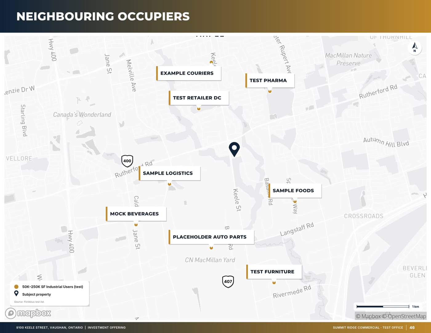
Sample pages are generated by the product from a fictitious test listing (9100 Keele Street, "Summit Ridge Commercial" test brand). Figures marked (test) are not real.
Related
Last updated 2026-10-14. General information for commercial real estate professionals, not legal advice.
Start with the fact sheet you already have.
Upload it, answer only what’s missing for the output you choose, and review a watermarked preview before you buy anything.