CRE marketing guide
Commercial real estate flyers and tear sheets: one page that earns the call
What to put on a one-page commercial property tear sheet or a short listing flyer, in what order, and how to keep every figure checkable.
What a flyer or tear sheet is for
A tear sheet is a single page that summarizes a listing: one strong photo, the handful of figures a buyer or tenant screens on, a few reasons to look closer and the broker’s contact details. The name comes from the days when a page was torn from a binder of listings and handed over at a meeting; today it is more often a PDF attached to an email, posted on a listing platform or printed for a property tour.
A flyer does the same job with a little more room, usually two to four pages: a cover, a summary, one page that shows the property or its location at its best, and contacts. Neither replaces a marketing brochure or an offering memorandum. Their only job is to make the right people ask for more, so everything on them should help a reader decide in under a minute whether the property fits.
The order readers scan a one-page summary
People read a tear sheet in a predictable order: the photo, the headline, the numbers, then the contact. Lay the page out in that order and they find what they need without hunting.
- Transaction and asset type first, in plain words: for sale, for lease or sublease; industrial, office, retail, land, multifamily or mixed-use.
- The address and the municipality, with the nearest major road or intersection if the street name alone means little to an out-of-town reader.
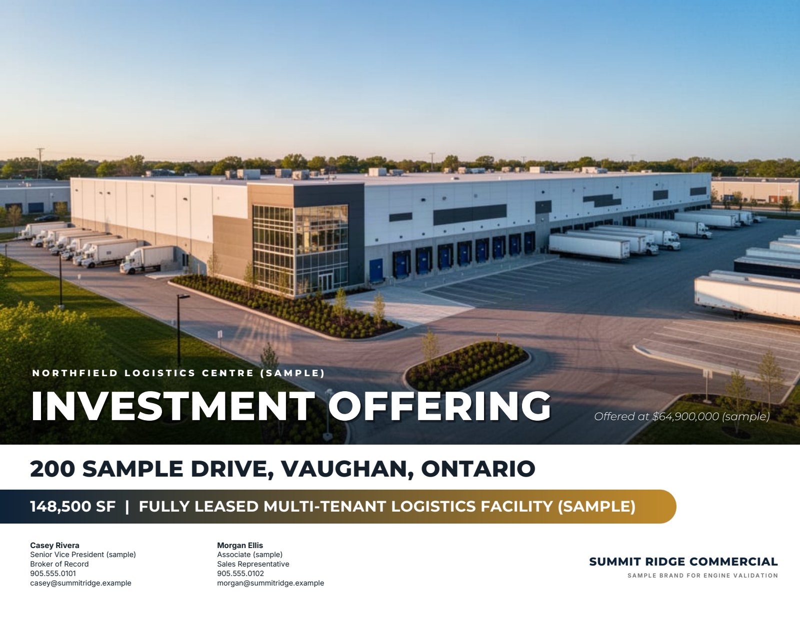
- One hero photograph: the best exterior or aerial, current and correctly exposed.
- Four to eight key figures, each with its unit: price or asking rent with its basis, building area, site area, clear height or ceiling height, available area, year built, parking, zoning.
- Three to five highlights, each a specific, checkable statement.
- Contacts: names, titles, direct phone numbers and email addresses, with the brokerage name and logo.
- Your brokerage’s approved disclaimer, in a size that is legible when printed.
Choosing the figures
The right figures depend on who is reading. An industrial user screens on clear height, shipping doors, power and site coverage; an office tenant on the available area, the rent basis and parking; an investor on price, net operating income, occupancy and the lease term remaining; a land buyer on site area, frontage, zoning and servicing. Pick the figures for the likely audience and leave the rest for the brochure.
Every figure needs its unit and basis. A rent is not useful without saying whether it is net or gross, per square foot per year or per month, and what the additional rent or TMI was estimated at for which year. A price per square foot needs the area it was divided by. If a figure is calculated, such as a cap rate from a stated net operating income, say so on the page. Quote metric and imperial areas where your readers use both, and round the same way everywhere.
If a figure is not confirmed, leave it off. A tear sheet is often the first thing a reader saves, and an error on it follows the listing around long after it has been corrected in the brochure.
Highlights that fit on one line
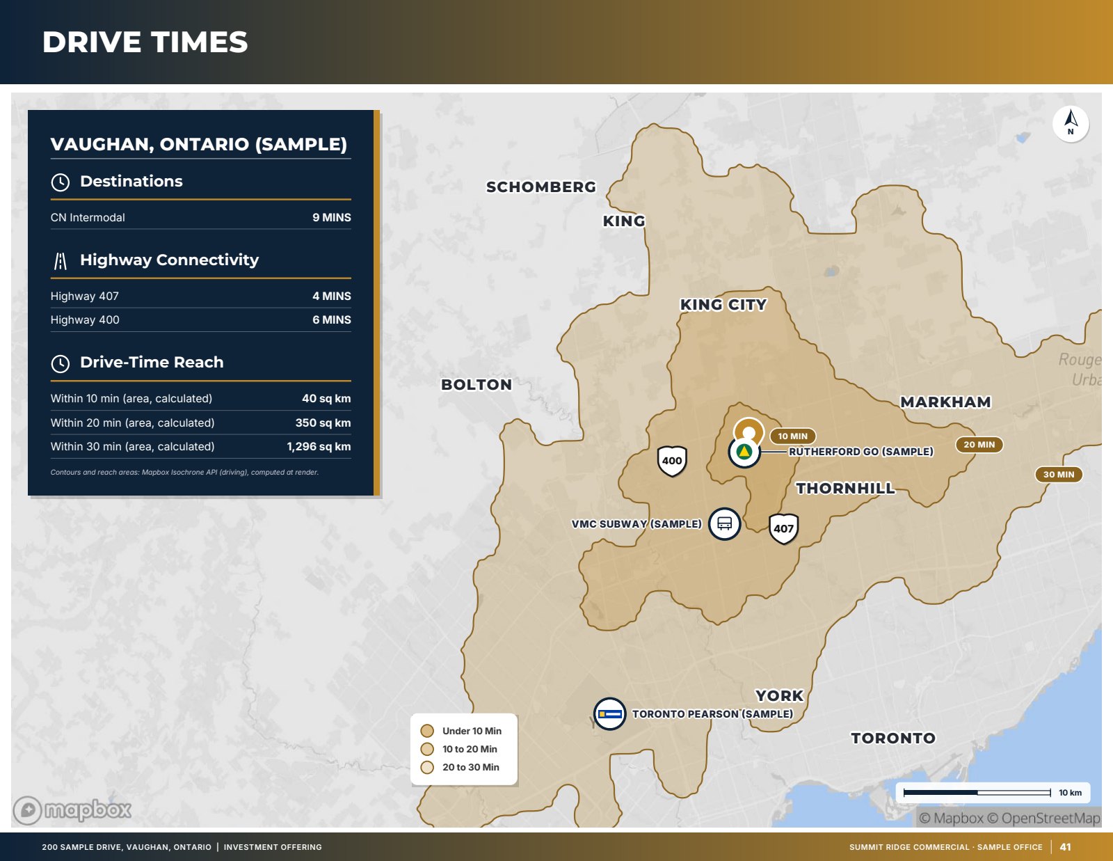
On one page, every highlight has to earn its line. Replace adjectives with facts the reader can check: the measured drive time to the nearest highway interchange instead of “excellent access”, the clear height and number of doors instead of “functional warehouse”, the tenant’s remaining lease term instead of “secure income”. Keep each highlight to one line at the printed size, and lead with the reason most buyers or tenants would call.
Avoid claims you cannot support on the page or in the brochure behind it. If the highlight depends on a zoning interpretation, a pending approval or a projected rent, it belongs in the longer document where it can be qualified properly.
Flyer pages: what to add after the summary
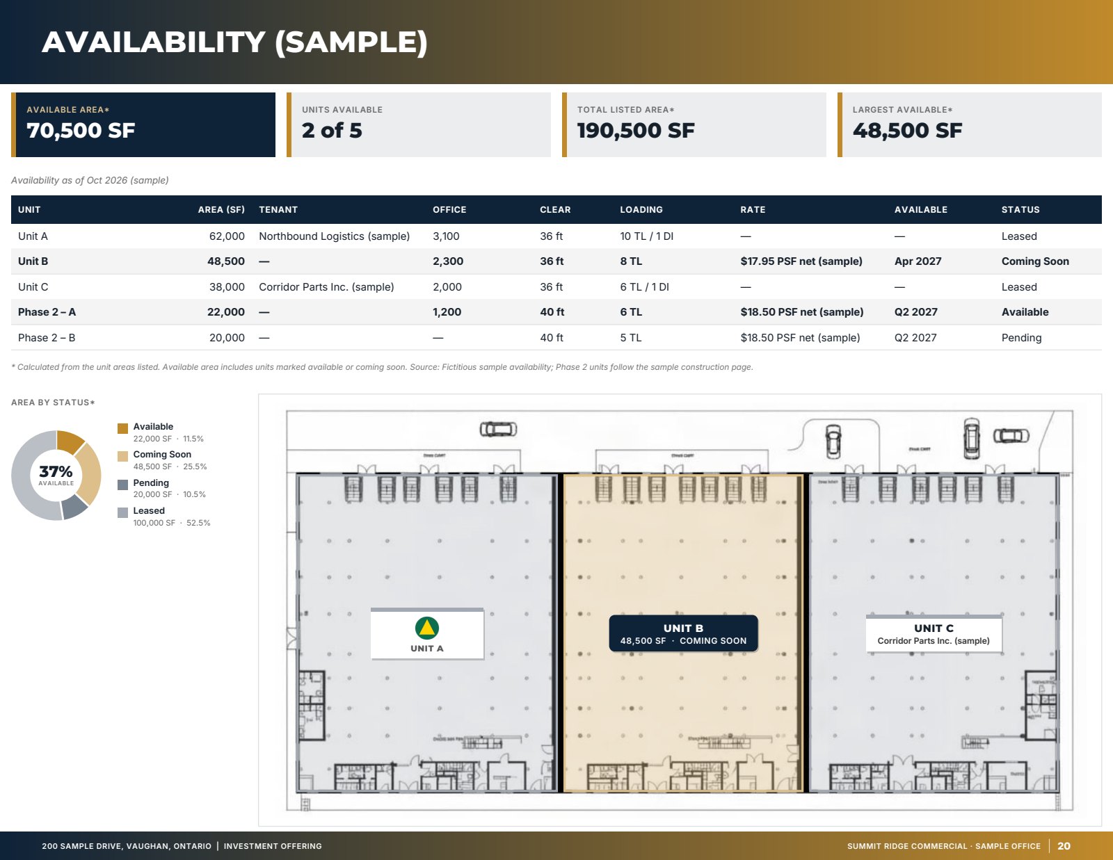
A short flyer gives you room for one more page after the summary, and the best choice depends on the property. For a building with good photography, a photo page shows it the way a visitor would see it. For a site where location is the story, a map with drive times or nearby occupiers does more. For a multi-unit leasing listing, a table of available units with area, rate and status lets a tenant shortlist in seconds. Finish with a back page carrying the contacts and the disclaimer so the flyer still works if only the last page is forwarded.
Lease availability sheets
A leasing listing with several units changes faster than any brochure. A one-page lease availability sheet keeps the moving parts in one place: a photo, the lease terms (net rent, additional rent estimate and the area available), a table of the units on the market with their area, rate and status, and the leasing contacts. Update the sheet whenever a unit is leased or a rate changes, put the date on it, and resend it to the brokers who asked for the last version.
Print and digital versions
Decide where the page will be used before you design it. A sheet handed out on a tour is usually printed on Letter paper in portrait; one attached to an email or posted online is read on a screen, where landscape often matches the brochure that follows it. For a commercial printer, ask whether they need bleed and crop marks. For email, keep the file small enough to attach without being stripped, and make sure phone numbers and email addresses are live links in the PDF.
Use the same colours, fonts and photo as the brochure and the listing website so a reader who later opens the longer document recognizes it straight away.
Canada and the United States
Canadian sheets commonly quote net rent with TMI or additional rent shown separately, areas in square feet with square metres for some readers, and site areas in acres and hectares. US sheets more often quote rent on a NNN, modified gross or full-service basis and areas in square feet and acres. Advertising by registrants is regulated in both countries: follow your brokerage’s policies and your regulator’s advertising rules, including how the brokerage name must appear.
How OfferingStack makes flyers and tear sheets
In the OM builder, the same property file that produces the brochure and full OM also produces a 1-page tear sheet (hero photo, key metrics, highlights and contacts), a flyer of up to 4 pages (cover, summary, the best visual page the data supports, and contacts) and, for leasing, a 1-page lease availability sheet with the lease terms and the available-units table. The tear sheet, flyer and teaser can be made in Letter portrait as well as Letter or A4 landscape, and print bleed with crop marks is an option. They are covered by the same unlock as a teaser. Figures come only from what you entered or sourced, calculated values keep their label, and you review the page before it goes out.
Tear sheet checklist
- Transaction, asset type and address are readable at a glance.
- One current, well-exposed hero photo.
- Four to eight figures, each with its unit and basis; calculated values labelled.
- Three to five one-line highlights a reader can verify.
- Direct contacts and the brokerage name as your regulator requires.
- The date the sheet was issued, especially on lease availability sheets.
- Approved disclaimer, legible in print.
- Same look as the brochure and listing website.
This guide is general information, not legal advice. A licensed professional should review any marketing material before it is distributed.
What these pages look like
Sample — fictitious property. Pages generated by the product for an invented sample listing with an invented brokerage brand. Figures marked (sample) are not real.
Related
Last updated 2026-10-15. General information for commercial real estate professionals, not legal advice.
Start with the fact sheet you already have.
Upload it, answer only what’s missing for the output you choose, and review a watermarked preview before you buy anything.