CRE marketing guide
Stacking plans in commercial real estate: how to build one for an OM or leasing brochure
What a stacking plan shows, the data each suite needs, how to colour it by lease expiry or tenant, and the mistakes buyers and tenants notice first.
What a stacking plan is
A stacking plan is a diagram of a building drawn floor by floor, top floor at the top, with each floor divided into the suites on it. Each suite is a block sized to its area and labelled with the tenant, the suite number and, usually, the lease expiry. Vacant space is shown in its own colour. At a glance the reader sees who is where, how much of each floor is leased and when the space comes back.
Stacking plans are most common for multi-storey office buildings and medical office buildings, but they work for any building with suites on more than one level: mixed-use buildings with retail at grade and offices above, multi-storey industrial or flex buildings, and multi-building parks where each building is drawn as its own “floor”.
Who reads it and what they look for
Different readers use the same diagram for different questions, which is why it earns a page in both investment and leasing documents:
- Investors and their analysts look at rollover: how much space expires in the same year, whether one tenant controls a floor or the building, and where the vacancy sits.
- Lenders look at the same rollover risk, and at whether the largest tenants expire before the loan term ends.
- Prospective tenants look for contiguous space: which floors have room to grow, which vacant suites sit next to each other, and who their neighbours would be.
- Leasing teams and owners use it as a working picture of the building when they plan renewals and relocations.
A rent roll gives the same facts as rows. The stacking plan turns them into a shape, which is why it is usually placed right before or after the rent roll in an offering memorandum.
The data you need for each suite
A stacking plan is only as good as the suite list behind it. Before drawing anything, build a table with one row per suite:
- Floor or level, using the building’s own names (Ground, Mezzanine, 2, 3, Penthouse) in the order they stack.
- Suite number, as it appears on the leases and the building directory.
- Tenant name, or “vacant”. Use the trading name the market knows, and keep the legal name for the lease abstract.
- Area in square feet (or square metres), on the same measurement basis for every suite. Say whether it is rentable or usable area.
- Lease expiry as a month and year. For a vacant suite, leave it blank rather than guessing an availability date.
- Optional: whether the space is subleased, under renewal negotiation, or held by the owner or a related party, if that can be disclosed.
Check the total. The suites on each floor should add up to the floor’s area, and the floors should add up to the building area quoted elsewhere in the document. If they don’t, find out why before the plan goes out: common areas, a different measurement standard or a suite that was demised and never updated in the rent roll are the usual reasons.
Colour by lease expiry or by tenant
The colour scheme decides what the reader sees first, so pick it for the document’s purpose:
- Colour by lease expiry year when the document is for investors or lenders. All space expiring in the same year shares a colour, so a cluster of rollover jumps out, and a legend lists the years in order.
- Colour by tenant when one tenant occupies several suites or floors, or when the document is for prospective tenants who care about neighbours more than expiry dates.
Whichever you choose, give vacant space a neutral colour that cannot be confused with leased space, and say in the legend what it means. Use the brokerage’s brand colours for the leased categories rather than a rainbow: a limited, consistent palette reads as more professional, and it prints better in black and white.
Drawing it so it can be trusted
A few rules keep a stacking plan honest:
- Size each suite in proportion to its area. A 2,000 sq ft suite drawn the same width as a 20,000 sq ft suite misleads anyone checking concentration.
- Keep floors in their real order, top to bottom, including floors that are fully leased to one tenant or fully vacant.
- Label each block with the tenant and suite where it fits, and the area and expiry where there is room; small suites can rely on the legend and the rent roll.
- If a floor’s area is not known, say that the floor total is the sum of its suites. If the suites do not fill the floor, show the remainder as unallocated rather than stretching the suites.
- Put the totals beside the diagram: total area, number of floors, leased percentage and vacant area. Mark them as calculated from the suite list.
Date the plan. A stacking plan is a snapshot as of a rent roll date, and renewals or new leases signed after that date should either be added or noted.
Confidentiality and what to leave out
Tenant names on a stacking plan are usually fine in a confidential OM shared after a confidentiality agreement, but think twice before putting the same plan in a public brochure or on a listing web page. Some leases restrict disclosure, and some tenants would rather their expiry dates were not circulated widely. For public leasing material, a version showing only vacant suites, their areas and availability is often enough.
Never show rents on the stacking plan itself. Rents belong in the rent roll, where they can be shown with their basis (net or gross, per square foot per year) and their escalations.
Stacking plan vs leasing plan vs floor plan
These three are often confused. A floor plan is an architectural drawing of one floor. A leasing plan is a floor plan with the available suites outlined, numbered and keyed to an availability table, used to market vacant space. A stacking plan is schematic: it gives up the real shape of each floor to show the whole building at once. A strong leasing brochure for a multi-storey building often uses both: the stacking plan to show where the space is, and a leasing plan for each available floor.
Common mistakes
- Suites that do not match the rent roll: different areas, an expired tenant still shown, a new tenant missing.
- Mixing rentable and usable area on the same plan.
- Too many colours, or colours that only work on screen.
- Leaving out the ground floor or the parking levels that carry retail or storage income.
- No date, so nobody knows which rent roll the plan reflects.
Building a stacking plan with OfferingStack
In the OfferingStack builder you add the floors top floor first (up to 24) and the suites on each floor (up to 12 per floor) with the tenant, suite number, area and expiry month, or mark a suite vacant. The page draws each suite in proportion to its area and colours the suites by lease expiry year or by tenant, using your brand colours, with vacant space in grey and a legend beside the stack.
Next to the diagram it prints the total area, the number of floors, the leased percentage and the vacant area, each labelled as calculated from your suite list. If you don’t enter a floor’s area, it is shown as the sum of its suites with a note saying so. The page only appears in your offering memorandum when at least one floor has suites, so an empty plan is never printed, and you review it before the document is sent.
Stacking plan checklist
- One row per suite: floor, suite, tenant or vacant, area, expiry.
- Suites add up to each floor, and floors to the building area in the document.
- Same measurement basis everywhere, stated once.
- Colour scheme chosen for the reader: expiry for investors, tenant for tenants.
- Vacant space in a neutral colour with a legend.
- Totals beside the plan, labelled as calculated.
- Dated to the rent roll it was built from.
- Tenant names and expiries checked against what the leases allow you to disclose.
What these pages look like
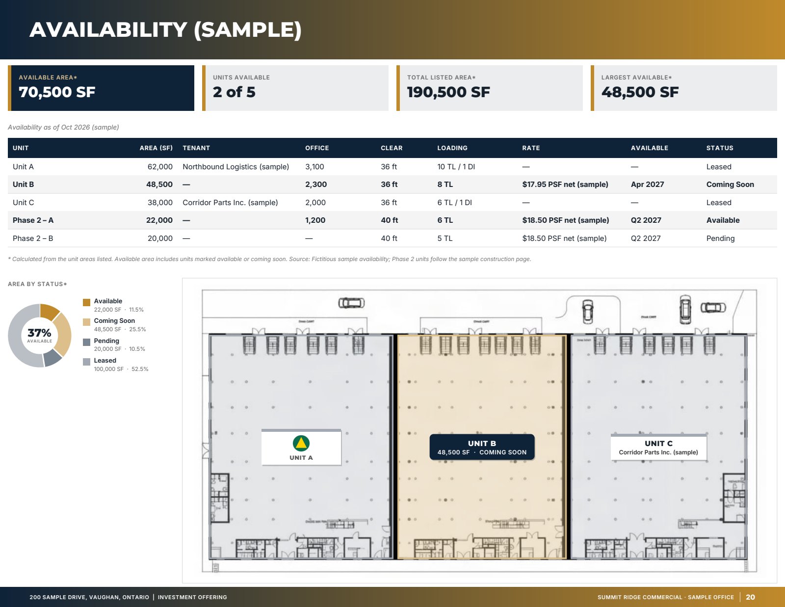
Sample — fictitious property. Pages generated by the product for an invented sample listing with an invented brokerage brand. Figures marked (sample) are not real.

Related
Last updated 2026-10-17. General information for commercial real estate professionals, not legal advice.
Start with the fact sheet you already have.
Upload it, answer only what’s missing for the output you choose, and review a watermarked preview before you buy anything.