CRE marketing guide
Floor plans and demising plans for commercial listings: what to show and how to mark them up
How to present floor plans and demising options in a CRE brochure or OM: preparing the plan, zones, callouts, unit sizes and the mistakes tenants spot.
Why plans matter in a listing
For space that is for lease, and for owner-user sales, the floor plan is often the page a prospect studies longest. Tenants and their brokers use it to test whether their program fits: where the offices, the open area, the warehouse, the loading and the washrooms are, and how many people or racks the space can hold. A clear plan saves a tour that would not have worked and makes the tours that do happen more productive.
Investors use plans differently: to judge how easily the space can be re-let or divided if a tenant leaves. That is where a demising plan comes in.
Floor plan, demising plan, leasing plan
The terms overlap, so it helps to be precise in the document:
- A floor plan is a drawing of one level showing walls, doors, cores and the main rooms.
- A demising plan shows how a larger space can be divided into separate premises, with the demising walls drawn in and the size of each resulting unit. Several options are often shown side by side: one large unit, two halves, or several smaller bays.
- A leasing plan is a floor plan with the available suites outlined, numbered and keyed to an availability table.
- A stacking plan is a schematic of the whole building, floor by floor, used for multi-storey buildings.
Preparing the drawing
Start from the most recent architectural or measured drawing, not a decade-old marketing plan. Then simplify it for marketing:
- Remove construction notes, dimension strings and title blocks that make the drawing unreadable at page size.
- Crop to the space being marketed, and include the north arrow and enough context (the street, the shared corridor, the loading court) to orient the reader.
- Export at high resolution as an image so that thin lines survive printing.
- Check the drawing against the current state of the space. Walls added or removed since the drawing was made are the most common error tenants find on a tour.
Marking it up: zones and callouts
A raw plan rarely tells a prospect what they need to know. Two kinds of mark-up help:
- Zones: tinted areas for office, warehouse, retail floor, mezzanine or available versus leased space, each with a label and, where useful, its area.
- Numbered callouts: small numbered markers keyed to a list, for features such as dock doors, drive-in doors, the electrical room, washrooms, a kitchen, a server room or the main entrance.
Use a few colours from the brokerage’s palette and keep them consistent across every plan in the document. Put a short key beside the plan rather than labels crowding the drawing.
Showing demising options
When a space can be divided, show the realistic options rather than every theoretical one. For each option give a name, the size of each resulting unit, and the facts a tenant of that size will ask about: the number of loading doors, separate entrances, washrooms, electrical service and whether the unit needs new demising walls or services. Two to four options are usually enough.
Make sure the unit areas in each option add up to the total area of the space, on the same measurement basis, and say whether areas are rentable or usable. If a division depends on landlord work, say so, and do not show a configuration the building cannot support without major work unless it is clearly labelled as conceptual.
What to show by property type
Each asset type has its own plan conventions, and prospects look for them first:
- Industrial: the warehouse, office and mezzanine areas as separate zones; dock-level and drive-in doors numbered; column spacing, clear height and sprinkler type in the plan details; truck court depth and trailer parking if the site plan is not shown separately.
- Office: cores, washrooms and exits; window lines; the open area versus private offices and meeting rooms; and for multi-tenant floors, the suite boundaries and the shared corridor.
- Retail: frontage width, depth, the storefront and rear service door, and the location of the unit within the centre, often shown on the site plan with the unit highlighted.
- Medical office: exam rooms, plumbing locations and accessible washrooms, since medical tenants budget heavily for plumbing.
- Flex and small-bay: each bay with its own door, office area and mezzanine, so a tenant can see what one, two or three bays combined would look like.
Plans for an owner-user sale
An owner-user buyer reads plans like a tenant, but with a longer horizon: they want to know whether the building can grow with them, whether part of it could be leased out, and what it would cost to adapt. Showing a demising option for a partial lease-back of surplus space can widen the buyer pool. If the building has expansion land or a permitted addition, a simple plan with the expansion area tinted and labelled as conceptual helps buyers picture it.
Measurement and accuracy
State the measurement standard once in the document. Office space in Canada and the US is commonly measured under a BOMA standard, and rentable area includes a share of common areas that usable area does not, so the two should never be mixed on one plan. For industrial and retail, say whether areas are measured to the outside of walls or the centre of demising walls when it matters.
Add a short note that plans are for illustration and not to scale unless they have been checked to scale. That protects the brokerage without hiding anything.
Where plans go in the document
In a leasing brochure, put the plans right after the property overview and the availability table, so a prospect can move from the list of suites to the drawing of each one. In an offering memorandum, plans usually follow the building specifications and come before the tenancy pages; demising options sit best next to the plans of the space they divide, or in a section on vacancy and re-leasing if the buyer will have to lease up the space. One plan per page, large enough to read, beats four thumbnails on a single page.
Common mistakes
- An old drawing that no longer matches the space.
- Plans so small or low-resolution that labels cannot be read.
- Unit areas on the demising plan that do not add up to the total or disagree with the availability table.
- Mixed rentable and usable areas.
- Too many colours, or colours that disappear when printed.
- No orientation: no north arrow, street name or entrance marked.
Floor plans and demising options in OfferingStack
In OfferingStack you upload a floor plan image and the page trims plain white margins automatically. You can draw up to eight tinted zones on it, each with a label and an optional area, add up to twelve numbered callouts with a short label and note, and list up to eight plan details. A side panel prints the areas, the callout key and the details. Each plan gets its own page, up to six plans per listing.
Demising options have their own page: up to six options, each with a name, an area and up to six details. If you add a demising drawing, it takes the larger part of the page with the options stacked beside it; without one, the options are laid out as cards. The areas you type are printed as you enter them, so check that they add up before you generate. Like every page, these only appear when you have added the plans or options, and you review the pages before anything is sent.
What these pages look like
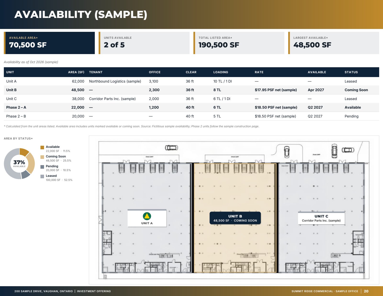
Sample — fictitious property. Pages generated by the product for an invented sample listing with an invented brokerage brand. Figures marked (sample) are not real.

Related
Last updated 2026-10-17. General information for commercial real estate professionals, not legal advice.
Start with the fact sheet you already have.
Upload it, answer only what’s missing for the output you choose, and review a watermarked preview before you buy anything.